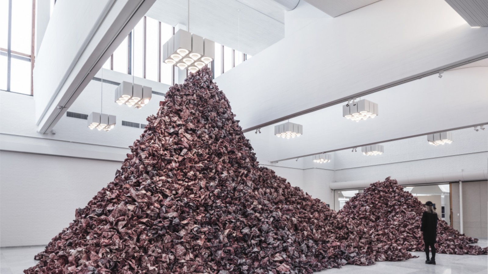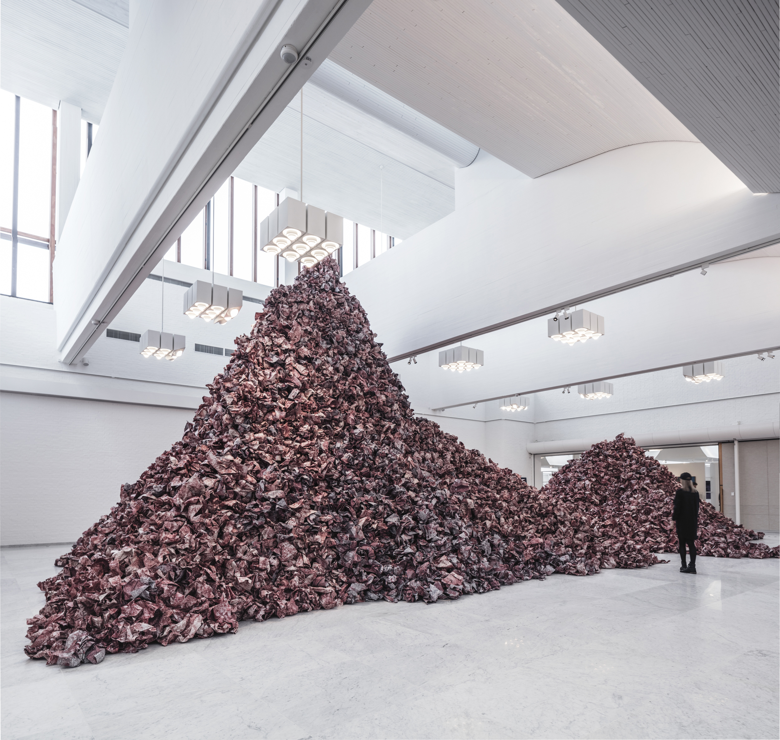
Main Gallery
The central idea of the Museum’s entire architecture is for visitors to head for the Main Gallery – formerly known as the Central Gallery. When you enter the Museum through the dark doors and entrance area, the Museum is relatively dark. But as you move around the building, light plays an increasingly more significant role. Even in the foyer there is more light, and it increases gradually as you move through the Side-lit Galleries and the Sky-lit Galleries and into the Main Gallery with its high ceiling and great openness. The Main Gallery is a perfect example of how Aalto worked with light. Remember to look up!
Two changes have been made to the Main Gallery since 2007. On one hand, improvements were made in terms of security; on the other hand, there have been visual upgrades. Following the restoration, the marble was polished, new hessian was attached to the walls, and the gallery was painted.
The Main Gallery is chiefly used for temporary exhibitions. Many artists fall for the Main Gallery and want to exhibit there because of the light and the size of the space.
Fun fact:
Near the door, through which you enter from the foyer before turning round the corner, there are three holes in the wall. Behind the three small holes there is a projector room. The original plan involved being able to screen films in the Main Gallery.

Foto: Rasmus Hjortshøj